Plain language and scan-friendly sections
Pages use headings, short cards, visible links and plain-English summaries so readers can scan the briefing without decoding raw document names.
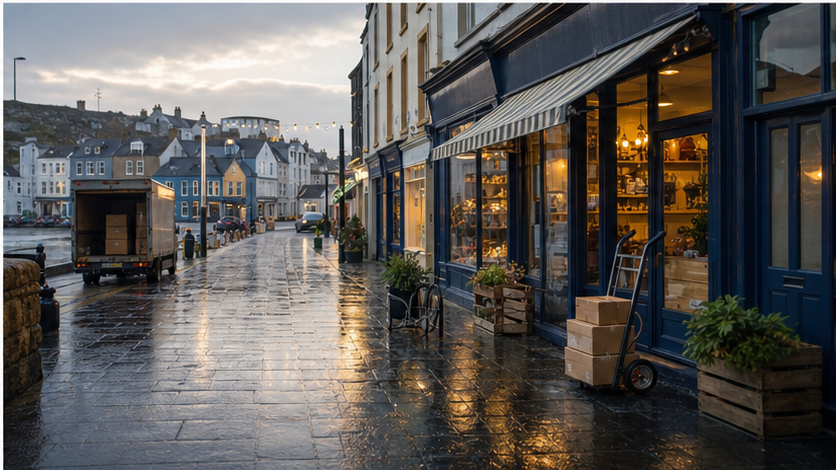 Local commerceAccessibility visual contextCommercial pages need useful, local visual cues.
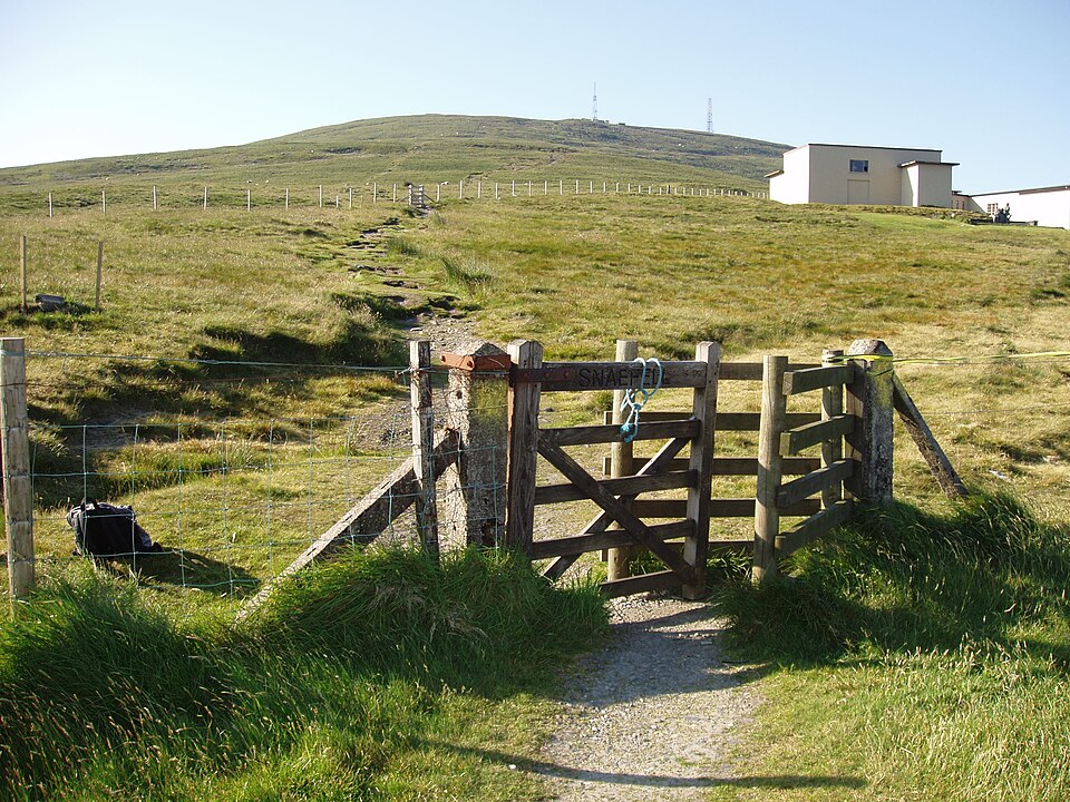 SnaefellMountain road above the IslandMorning context should feel rooted in the place readers know.
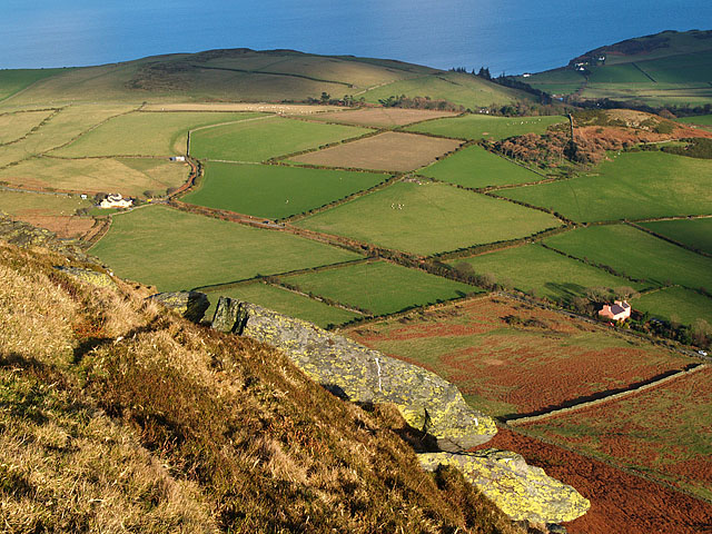 South BarruleUpland views and local geographyA quieter visual anchor for weather, travel and public-service stories.
Accessibility · readable by default
Accessibility notes for the public website: mobile layout, keyboard-friendly links, restrained motion, readable source labels, known limits and how to report a problem.
Practical design rules used across the public website.
Pages use headings, short cards, visible links and plain-English summaries so readers can scan the briefing without decoding raw document names.
Public pages are checked on phone-sized screens so menus, cards and buttons stay readable without sideways scrolling.
The site uses standard links and buttons. Interactive elements such as the subscribe popup include close controls and focus handling.
The site avoids motion-heavy effects. Useful content and navigation should remain available without animation.
Reader pages, source links, FOI links, archive search and public status pages are labelled so readers know what will open before they tap.
Desktop and mobile views are checked for overlap, clipping, unreadable text, off-canvas content and severe density issues.
These are the places where reader feedback is especially useful.

Send the page URL, device/browser if known, and what was hard to use. Screenshots are helpful when safe to share.
Latest issue for context: Is the relationship between Manx Care and the DHSC getting stronger?.
South Barrule · Upland views and local geographyDouglas · Promenade, memorials and daily movement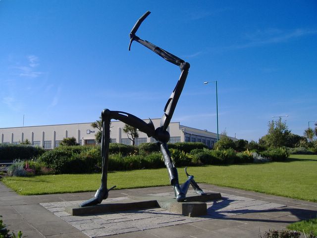 Manx symbol · Three Legs context without generic stock
 Morning briefing · Local news before the day starts